Dot Calm
Dot Calm
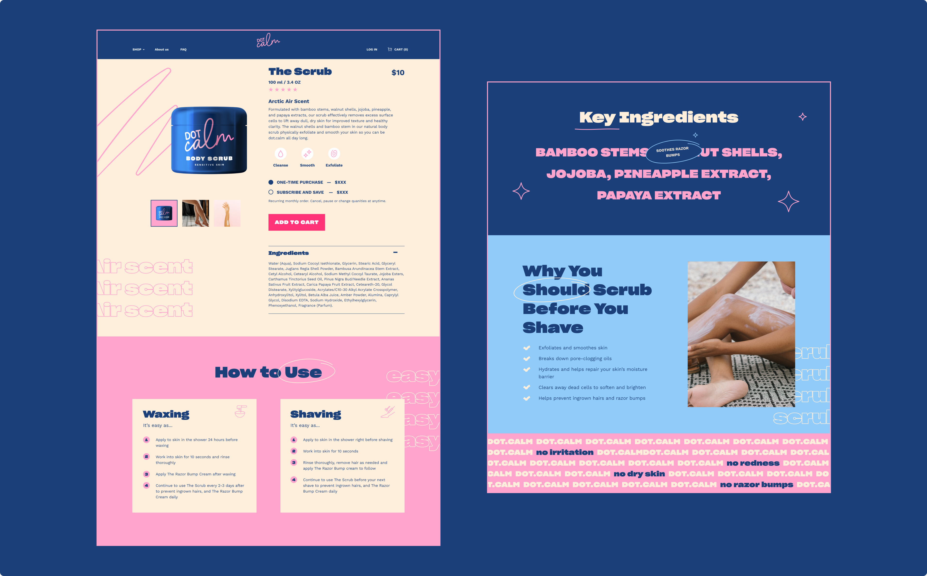
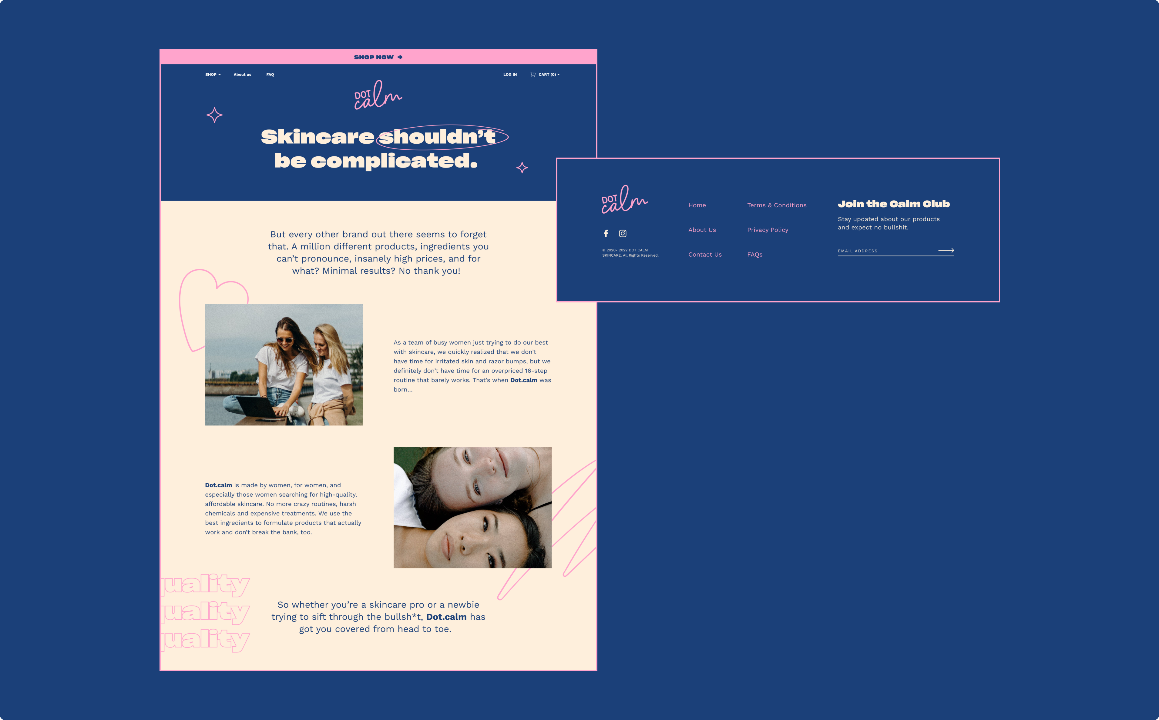
Aftershave skincare for woman. Because someone we love had a problem they shared. And we cared enough to solve it in the best way possible.
User Experience
The challenge
In an ever saturated skin care market we realised our TG were still not happy with available solutions and have been looking for someone they can trust when it comes to skin sensitivity. It’s not just the product they care about; they deeply care about the brand too.
The outcome
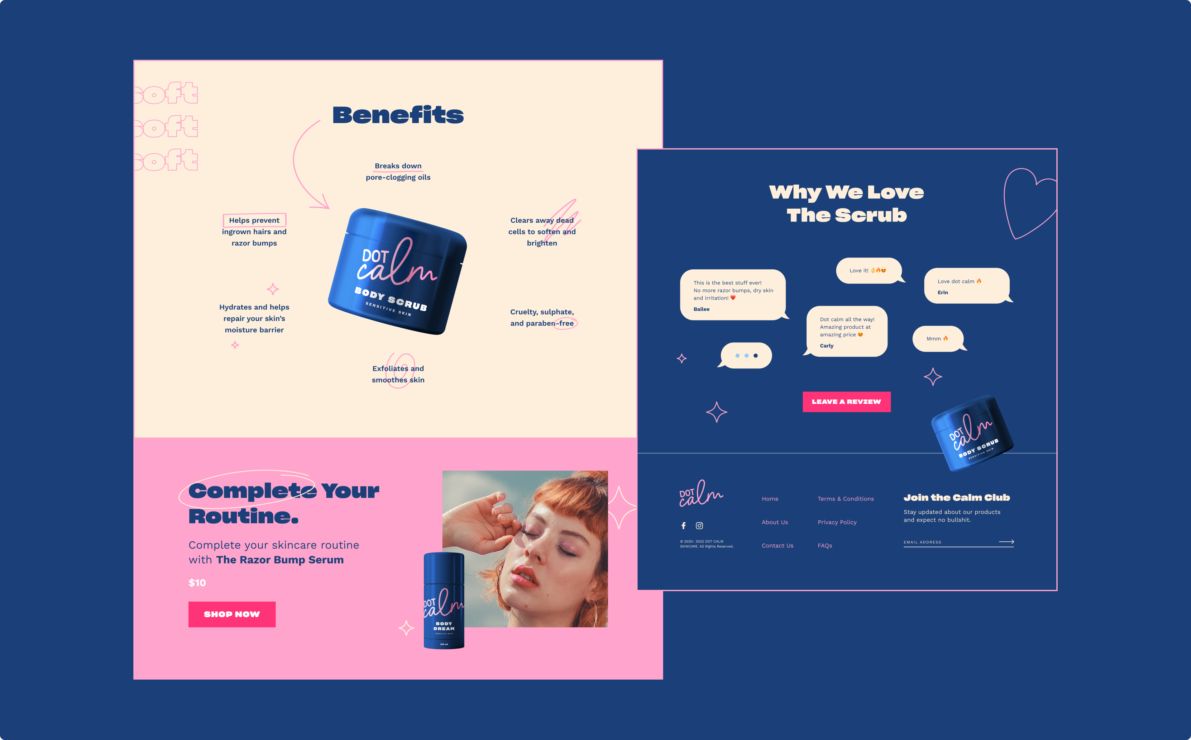
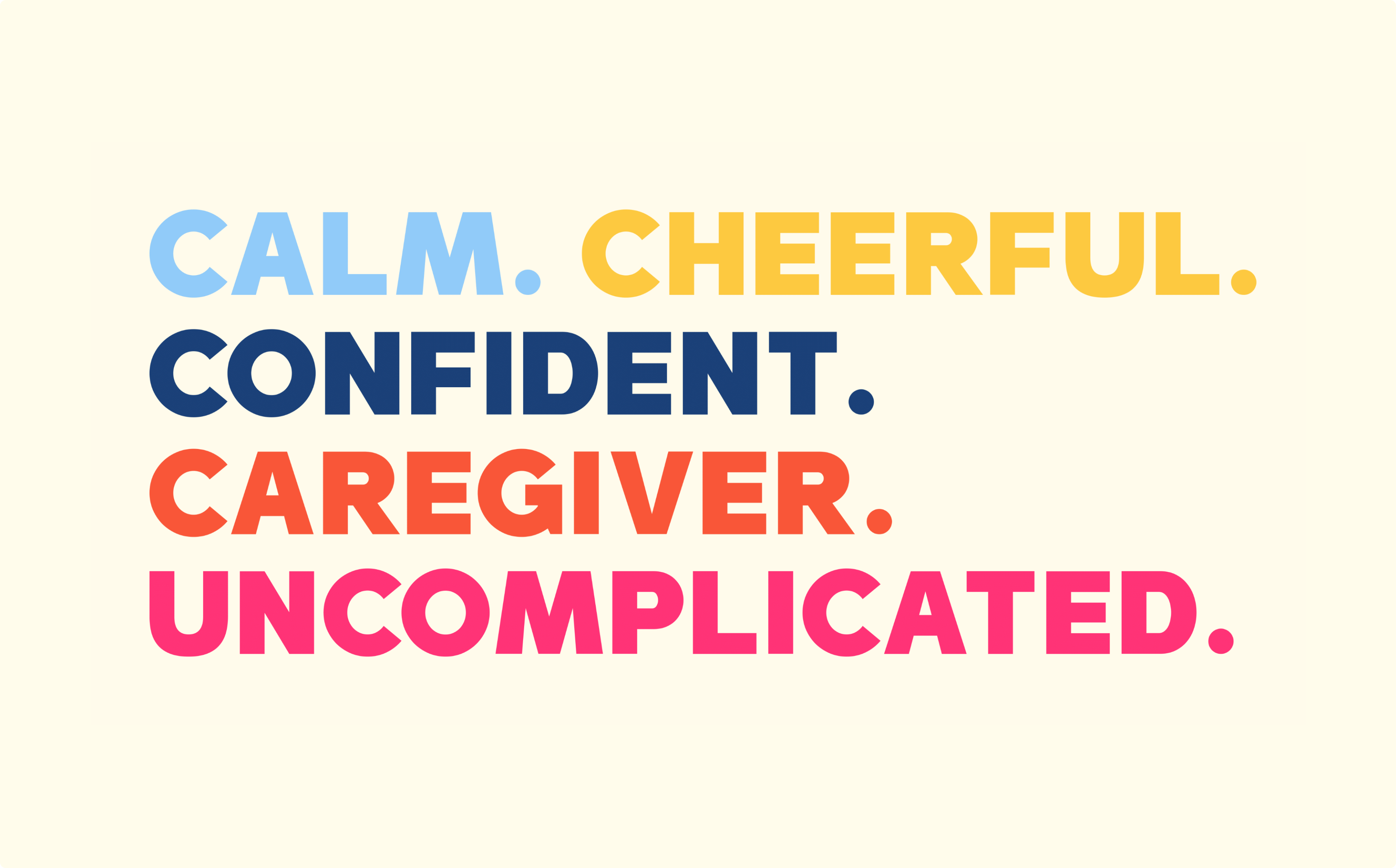
We created a brand that talks to you. Blunt and Bold but deeply caring.
The Title
Our in-house team of strategists & consultants is complimented by our expert network of world-class specialists.
Details
Design Rationale
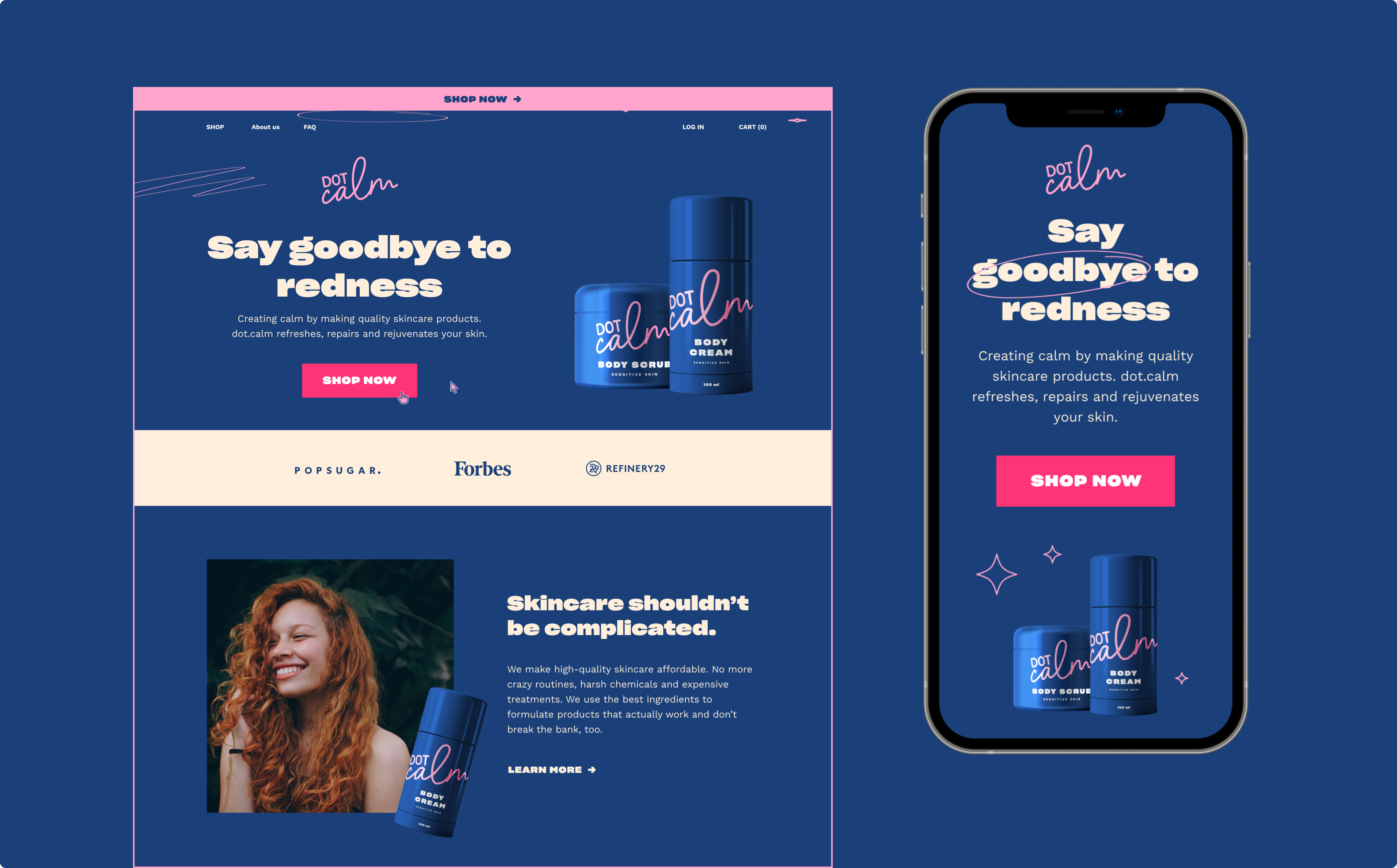
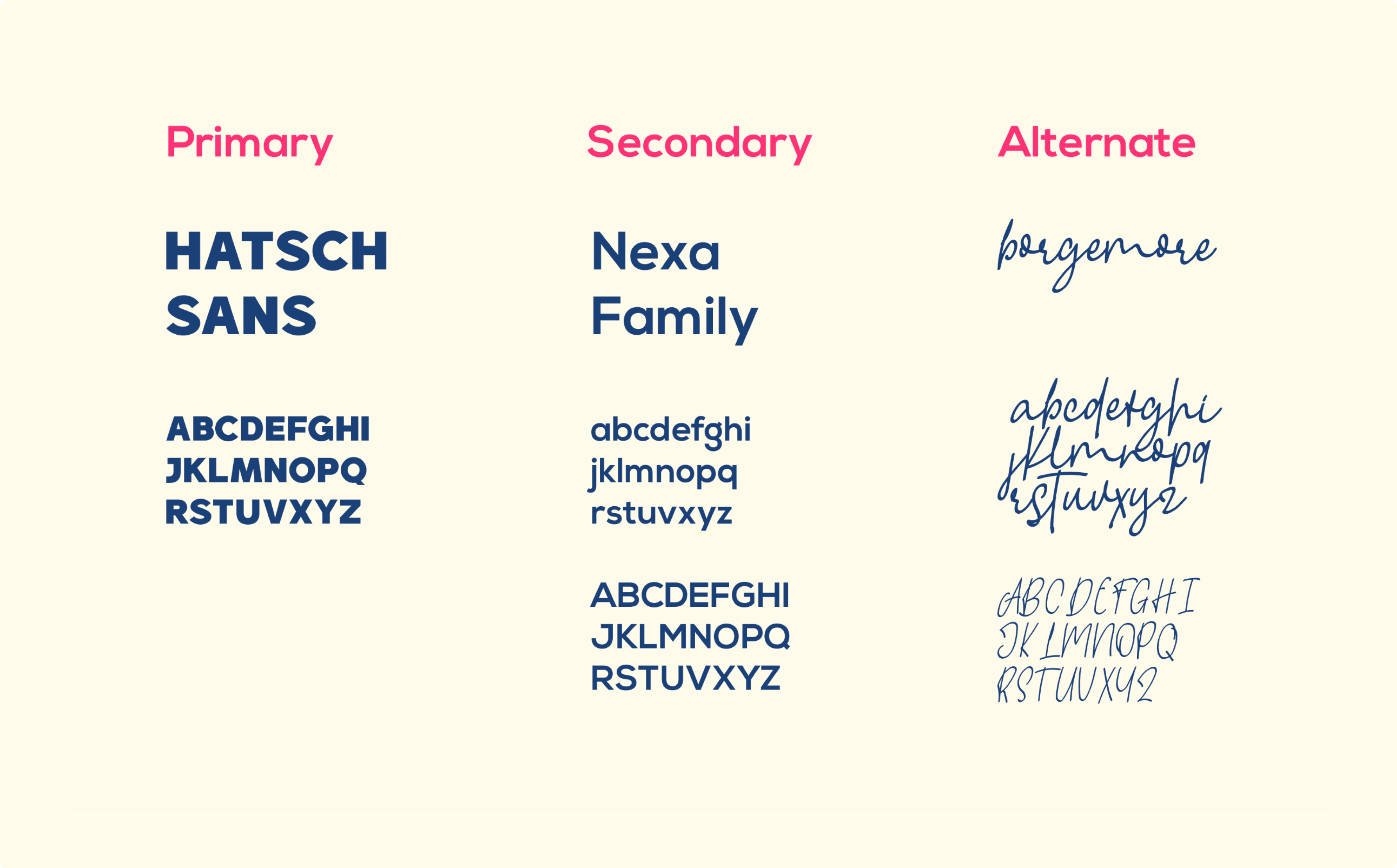
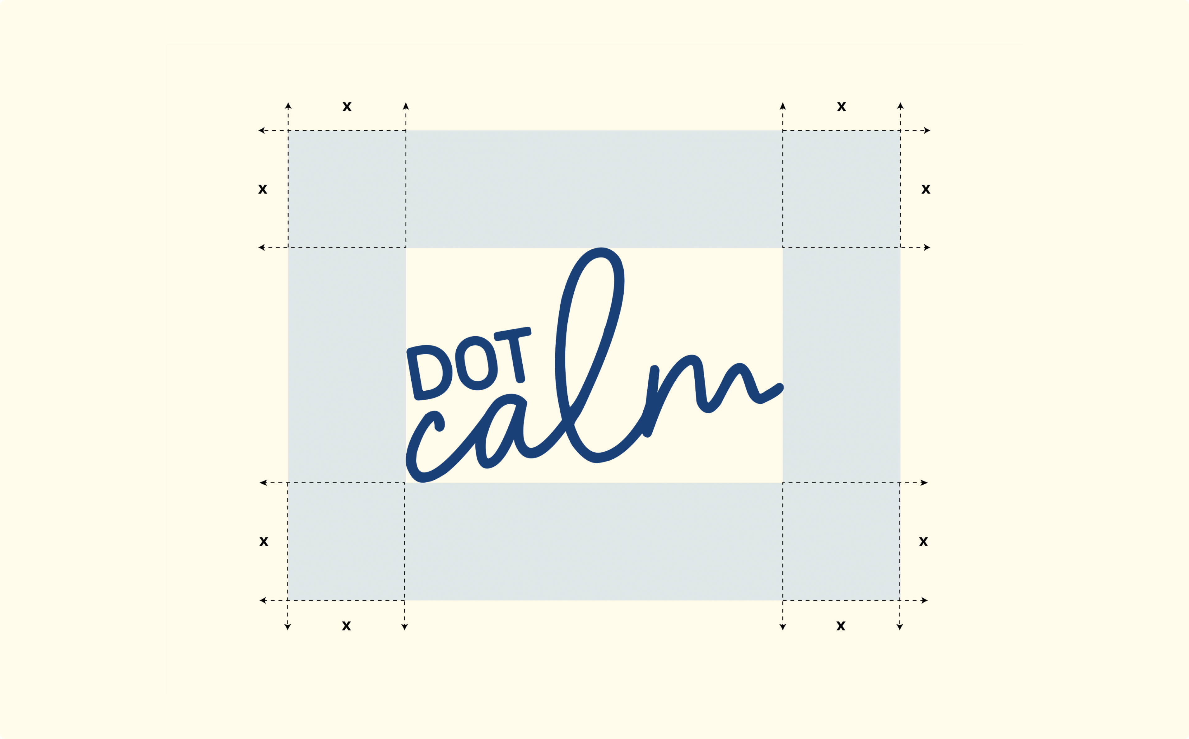
We highlighted the word ‘calm’ and established a handwritten personal feel with an unpretentious and approachable typeface combination oozing of good vibes. Straightforward but with personal tweaks, soft and friendly corners. The custom handwritten typeface encapsulates the brand voice of a tough lover relentless in making your life easier.
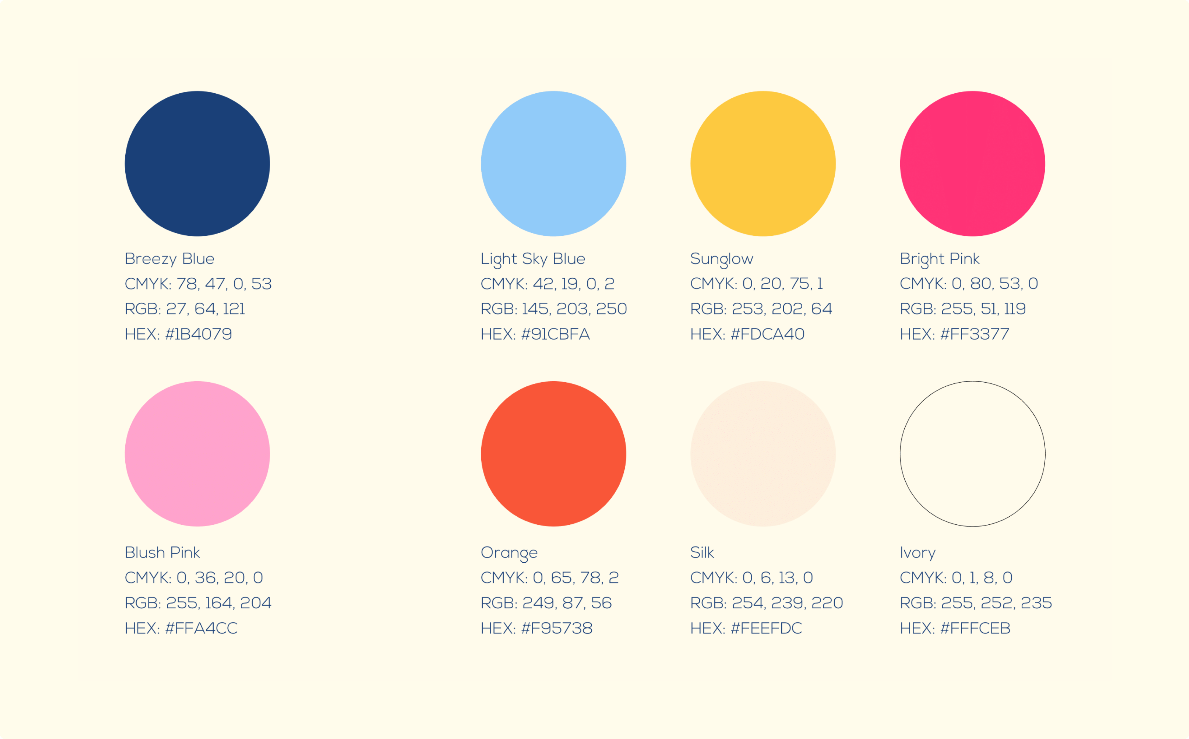
Through a thoughtfully balanced script wordmark and soothing color palette, we created a brand system that comes together to express an immense care for your skin otherwise ignored.
Project Testimonial

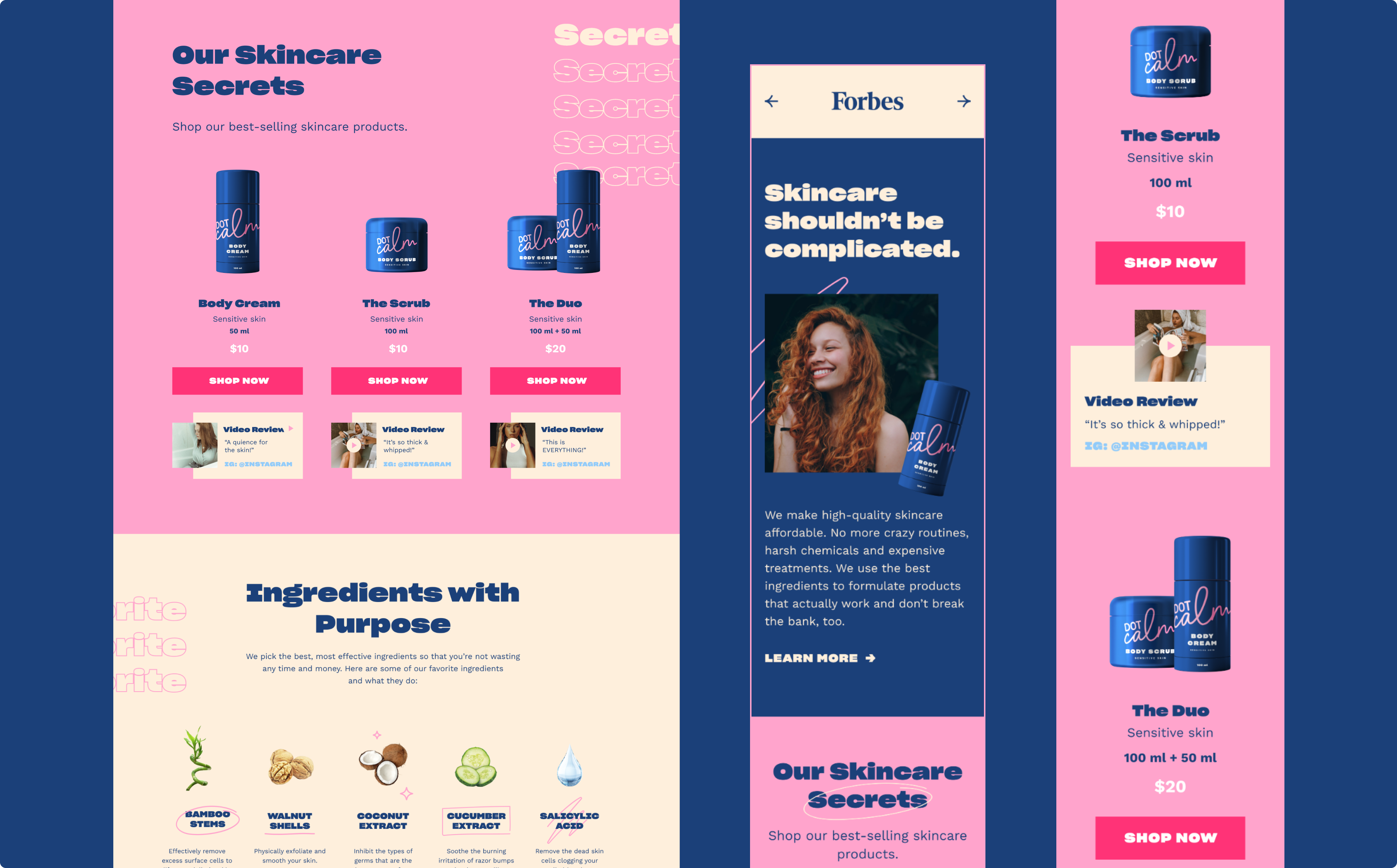
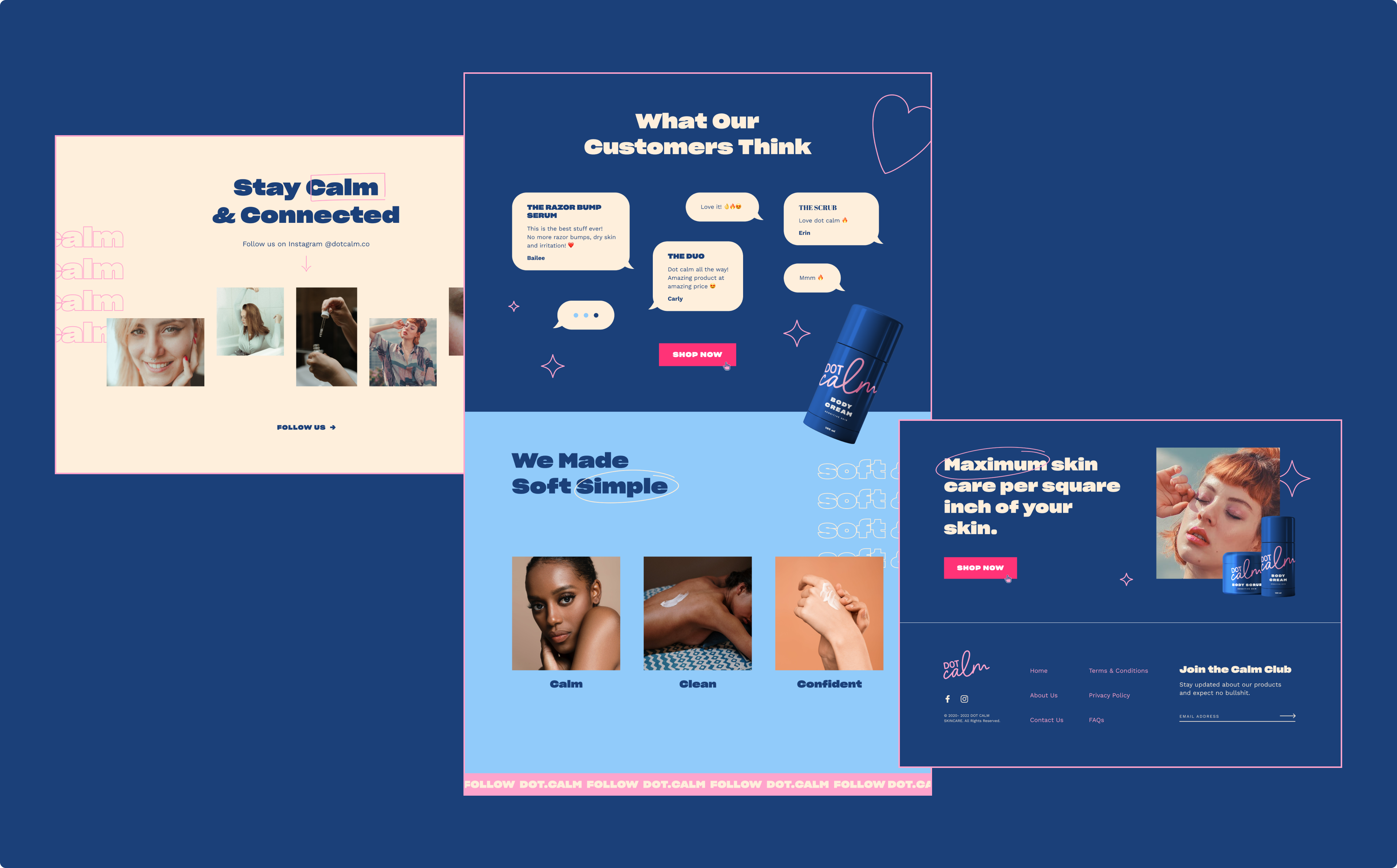
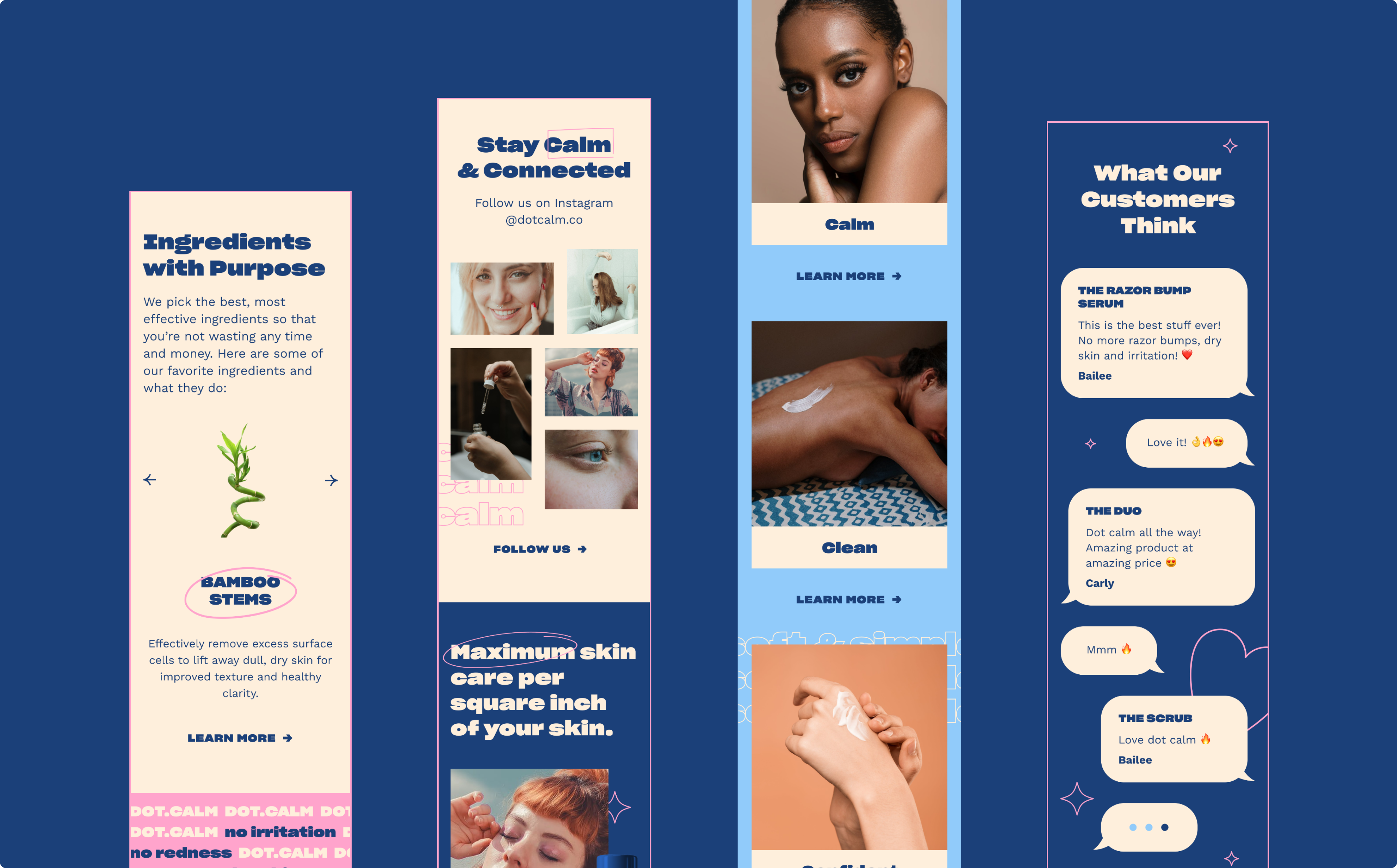
We designed a super minimal and slick website that cuts through the clutter and represents Structured in it’s true sense.


