The Good Bug is a science-forward DTC wellness brand focused on daily Probiotics, gut health, and long-term well-being. Their products are rooted in clinical research, designed to help consumers build sustainable gut health habits
The Good Bug’s site faced low conversions due to dense content, poor navigation, and unclear product organization. Our redesign simplified shopping, built trust, and increased AOV while preserving scientific credibility

Reasoning
-
01Improved navigation with breadcrumbs to reduce drop-offs and encourage deeper site exploration
-
02Enhanced content readability through better spacing and typography, making complex product info easy to digest
-
03Clarified product value with sharp headlines, key USPs, and ratings to drive faster purchase decisions

Reasoning
-
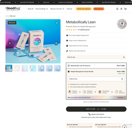
01Streamlined product details into bite-sized accordions to keep the page clean and conversion-focused
-
02Optimised the buy box with bundles, visual cues, and trust signals to lift AOV and improve add-to-cart rates

Reasoning
-
01Reframed section title to “Science, not hacks” to align with the brand’s science-forward positioning
-
02Introduced intent-driven CTA (“Is this product right for you?”) to engage high-intent users and build trust
-
03Transformed testimonials into actionable results with before-after photos, measurable metrics, and timelines
-
04Added customer age, profession, and lifestyle cues to boost relatability and trust
-
05Highlighted real-world outcomes (e.g. 8 kg weight loss in 6 months) to drive product credibility

Reasoning
-
01Designed a sticky tabbed section (“About”, “Why this product”, “How to use”, “Reviews”) for seamless deep-dive navigation
-
02Integrated trust-building content like “Is it safe for you?” to guide informed purchase decisions
-
03Broke down product science with bite-sized, jargon-free auto-scroll cards showing day-by-day impact (Day 1 to Day 90)
-
04Added contextual CTAs (e.g. “How L-Carnitine works”) to drive transparency and educate curious customers. Simplified product usage instructions with clear, visual storytelling to increase adoption and satisfaction

Reasoning
-
01Created an interactive research report showcasing controlled trial outcomes with placebo vs non-placebo tabs
-
02Simplified scientific data with easy-to-read graphs while preserving credibility and depth
-
03Highlighted key results (e.g. 87% saw weight reduction, 95% improved metabolic health) to drive trust

Reasoning
-
01Added transparency through a CTA linking to the full clinical research paper. Made complex science approachable for first-time users without compromising on accuracy

Reasoning
-
01Habit-Led Merchandising Strategy: Shifted from generic upsells to a structured 4-step regimen: Cleanse, Restore, Nourish, Maintain
-
02Added trust signals by showcasing outcomes from following the regimen
-
03Merchandised complementary products as a guided routine to drive higher engagement and repeat usage. Designed an intuitive component that clearly explains each step and its product benefits

Reasoning
-
01Simplified homepage banner with a clear, prominent CTA to drive action

Reasoning
-
01Introduced “Shop by Concern” section right below the banner to guide high-intent users
-
02Added a “View More” CTA with pop-up showcasing all concerns with relatable visuals
-
03Focused first scroll on fast-tracking product discovery and reducing bounce
-
04Designed to capture and convert high-intent traffic early in the homepage journey

Reasoning
-
01Built a tabbed section for core categories: Probiotics, Cleanse, Fiber, Ferments
-
02Each tab opens with a clear benefit-driven card (e.g. “Repair Your Gut”) and short explainer
-
03Integrated “Shop All” CTA within each tab to drive deeper category exploration
-
04Surfaced relevant products and bestsellers within the tab for contextual discovery. Positioned this section on homepage to educate and convert users early in the journey

Reasoning
-
01Redesigned results section to simplify technical data and highlight key impact metrics (e.g. 9x improvement)
-
02Linked CTA to full clinical research for transparency and validation of claim
-
03Added scroll-triggered animations to make scientific content more engaging and memorable
-
04Used icon-based trust indicators to communicate product formulation, technology, certifications, and testing. Balanced credibility with accessibility by “dumbing down” complex data for broader user understanding

Reasoning
-
01Brought the regimen-led merchandising strategy to the homepage with a more educational, content-rich format
-
02Clearly explained the 4-step regimen (Cleanse, Restore, Nourish, Maintain)
-
03Branded the strategy under “Upgrade to Regimen” to position gut health as a long-term investment. Designed to drive subscription mindset and encourage multi-month product adoption. Aimed to build customer understanding and commitment to habit formation from the first touchpoint

Reasoning
-
01Humanised testimonials with customer name, profession, and lifestyle details to boost relatability
-
02Enhanced testimonial section by linking each story to the specific product mentioned, driving targeted traffic. Turned trust-building content into a revenue driver by creating seamless paths to purchase

Reasoning
-
01Prioritised best sellers and new launches at the top of the mega menu to drive product discovery
-
02Created a “New Launch” banner for surfacing fresh SKUs and boosting visibility of new products
-
03Structured “Shop by Categories” by both product range and customer concerns for intuitive navigation. Optimised the menu to support both casual browsing and high-intent shopping journeys. Leveraged the most-clicked navigation element to strategically guide users toward conversion-focused pages

Reasoning
-
01Structured category pages to guide users through “Shop by Concern” tiles with relatable imagery

Reasoning
-
01Layered discovery: surfaced best sellers, new launches, and then expanded into concern-based merchandising

Reasoning
-
01Used consistent product taxonomy and terminology across site to reduce friction and build clarity. Preceded product listings with contextual banners (e.g. women’s health) to drive relevance
-
02Optimised product cards with subtext, ratings, and pack toggles to enable faster add-to-cart actions
01
Improve conversion rates through simplified navigation, clearer product positioning, and stronger trust signals
02
Increase AOV via regimen-led merchandising and habit-driven upsells
03
Drive subscription mindset with educational UX and long-term health positioning
04
Foster customer trust and transparency through science-forward storytelling and data presentation